Overview
| By | Mike Nelson |
|---|---|
| Supports | * front matter * 1 layer of nesting (each article can put in a part) * back matter |
Purpose
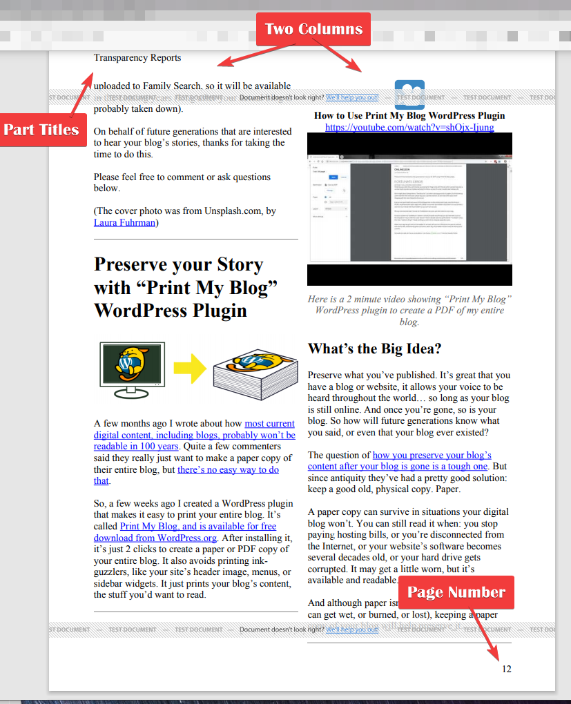
Designed to look good when viewed from a device or printing to paper. The two-column layout leads to more compact content, especially good if your content doesn’t require the full page width
Features
- Main matter is divided into two columns, while front matter uses the full page width.
- Content can be divided into parts with a special part opening area using the full page width.
- The title page can include a title and preamble. Other content can immediately follow, without needing a page break.
- Each article includes just its title and content, and an optional dividing line to help distinguish between articles.
- If your content is already divided into columns, optionally automatically remove them to improve the layout.
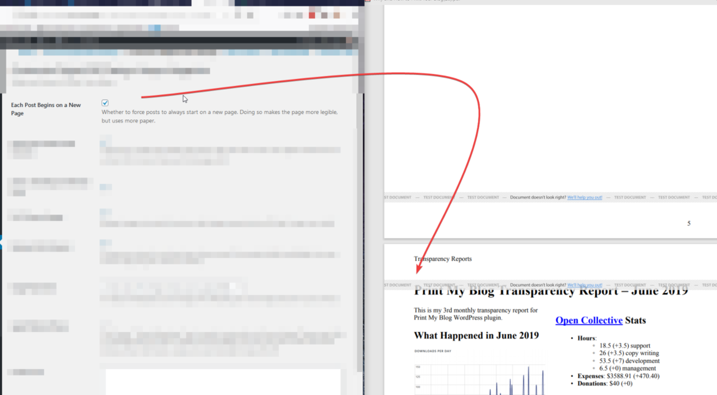
- Optionally begin each post on a new page, or be shown immediately following the previous one.
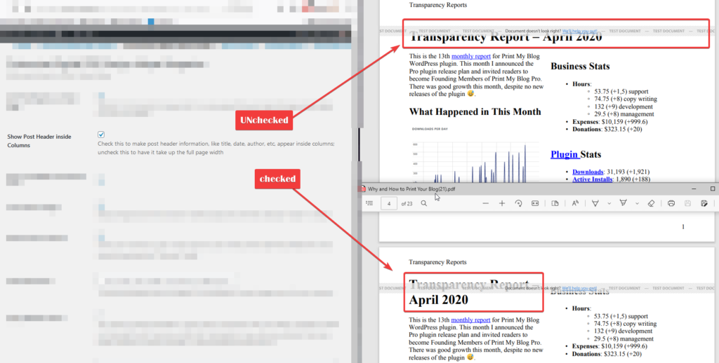
- Optionally have each article title take up the full page width, or show them inside columns.
- Internal links (hyperlinks to content included in the project) are replaced with page references.
- External links (hyperlinks to content on the internet) are left as-is.
Page Layout
- Main matter pages fade from white to a color of your choosing in the corner where your logo and page number are shown.
- Page numbers in bottom-right corner, and part titles in the top-left. Front-matter’s pages are numbered with Roman numerals
Special Instructions
Front matter defaults to using the full page width. To force something to be divided into columns, add the CSS class “mayer-columns” inside your content.
Main matter defaults to being divided into columns. To force something to use the full page width, add the CSS class “mayer-wide” inside the content.
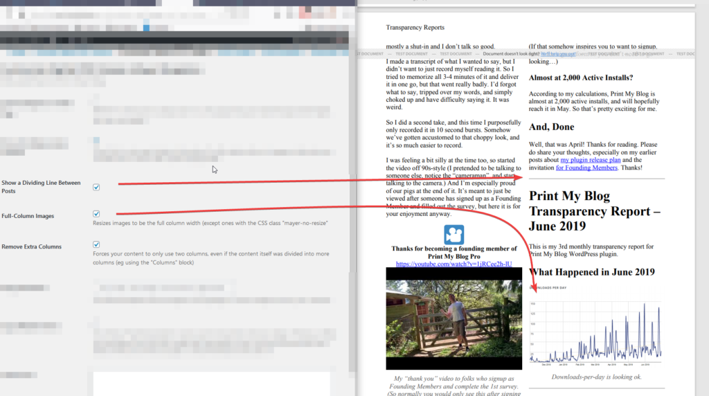
Generic Settings

“Custom CSS” is CSS code to be used only in files PMB Pro generates; it won’t be used anywhere else on your website. Because PMB Pro uses Prince CSS, use any CSS from the official Prince documentation.
