Overview
Print My Blog (PMB) Pro’s CSS classes are used to give content a special design in your projects.
In WordPress’ Block Editor (Gutenberg), to add a CSS class onto any block,
- Click on a block
- On the righthand “Settings” page, click “Advanced”
- Under “Additional CSS class(es)” add any CSS classes
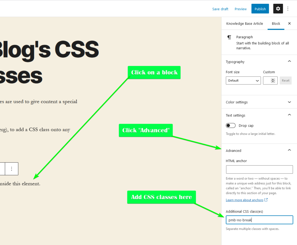
If you want to add more than one, just separate them with a space.
Controlling Pagebreaks
pmb-break-before
Always have a page break before this element. Eg. you want a title to always appear at the top of the page.
pmb-break-after
Always have a page break after this element. Eg. you want an image to always be the last item on the page.
pmb-no-break
Avoid a page break inside this element. Eg, you might want to use this to keep a paragraph of text all on one page, rather than having it split across two.
pmb-no-break-after
Avoid a page break after this element. Similar to pmb-no-break-before
pmb-no-break-before
Avoid a page break before this element. Eg, you might want to have a paragraph or image always be on the same page as the paragraph preceding it.
Controlling Whether Content Appears on the Website, Print, etc.
pmb-print-only
Only shows the element in a PMB quick print or PMB project, not when viewing on the frontend of your website. Eg, you might use this for text or an image that’s unnecessary on the frontend of your website, but helpful in a PDF or other format of project.
pmb-screen-only
Only shows the element on the frontend of your website, not when in a PMB quick print or PMB project. Eg, interactive content like a video or a form probably only makes sense to view on the website, but not in a PDF.
Controlling Block Floating/Snapping
Control whether and how blocks should be removed from the normal content flow.
pmb-dont-snap
Prevents this element from snapping, even if your design is set to snap images to the nearest page edge. Eg. if you have an image which must appear directly after a paragraph of text, add “pmb-dont-snap” as a CSS class onto the image. Other images will snap according to your design and its settings.
pmb-float-top
Makes the element float to the top of the page (or in multi-column designs, to the top of the column). Useful if you want an image or a line of text to always appear at the top of the page (but not quite in the top margin).
pmb-float-top-page
The same as pmb-float-top-page, except always floats the item to the top of the page. If using pmb-wide, you probably want to use this too.
pmb-float-bottom
Makes the element float to the bottom of the page or in multi-column designs, to the top of the column). Useful if you want an image or text to always appear at the bottom of a page (but not quite in the bottom margin).
pmb-float-bottom-page
The same as pmb-float-bottom-page, except always floats the item to the top of the page. If using pmb-wide, you probably want to use this too.
Controlling Image Resizing
pmb-dont-resize
Lets this image be as big as it wants, regardless of the “Maximum Image Height” set in the design.
pmb-dynamic-resize
Forces this image to be dynamically resized. It will shrink in order to fit on the current page rather than cause a pagebreak.
pmb-dont-dynamic-resize
Prevents this image from being dynamically resized automatically.
pmb-wide
In multi-column designs, makes the block span all columns. Often used with pmb-float-top-page or pmb-float-bottom-page.
pmb-dont-change-image-quality
Prevents the specified image from having its quality/resolution automatically adjusted according to your design settings. Image blocks with this CSS class will keep the same quality/resolution as seen by visitors of your website.