Overview
This is the 30th monthly report for Print My Blog (PMB) WordPress plugin.
What Happened This Month
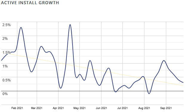
Plugin Stats
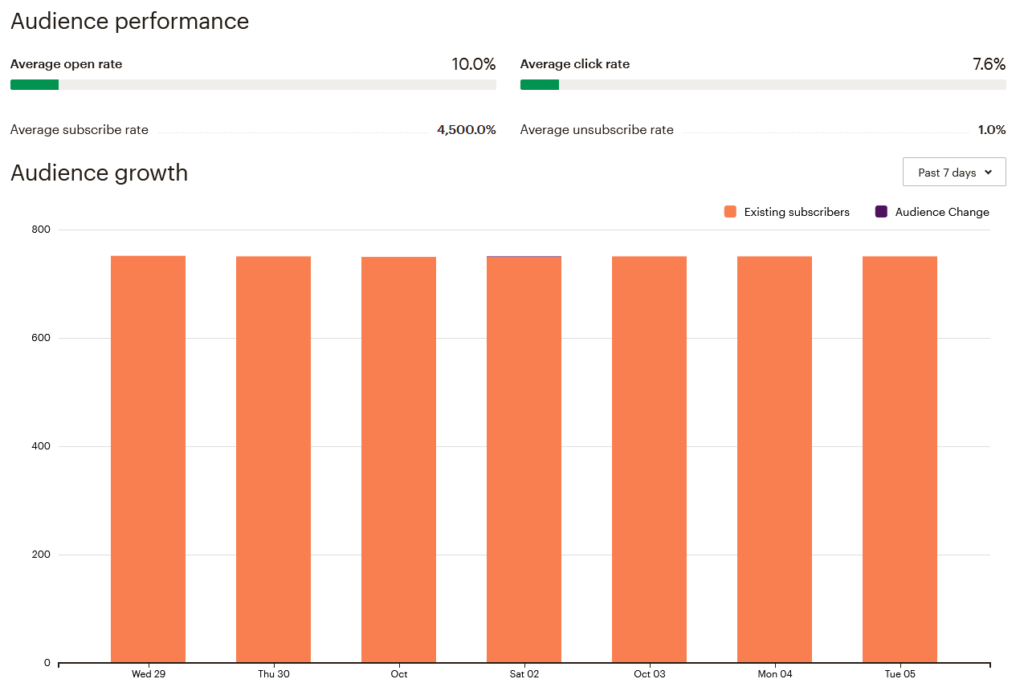
Mailing List Stats
Stats from my MailChimp mailing list.
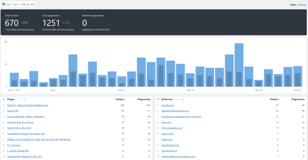
Website Visits
Stats from my site’s Koko analytics (don’t need no Google Analytics, thank you!)
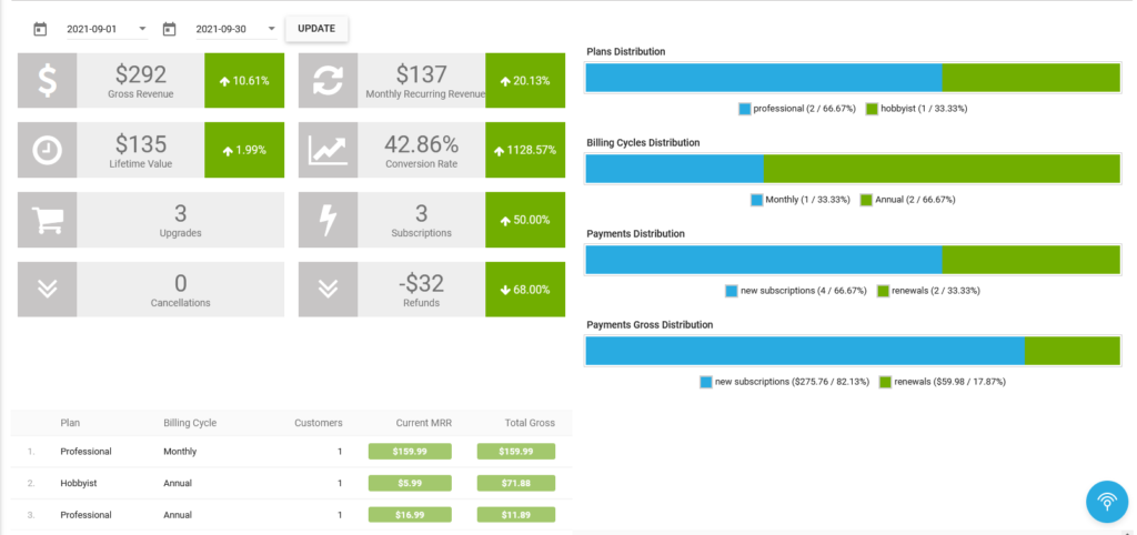
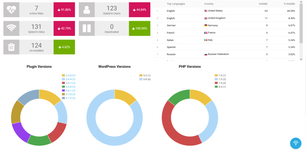
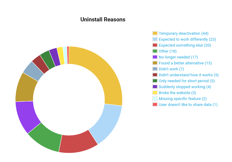
Freemius Stats
Freemius gathers other stats about sales and sites using the plugin.
Business Stats
- Hours:
- 111.75 (+3) support
- 160.25 (+2) marketing
- 414 (+13) development
- 74 (+6) management
- Expenses (Opportunity Cost): $28,393.75(+$996.45)
- Expenses (Out-of-pocket) $125(+$30)
- Income: $2,901.26.26 USD (+292)
Plugin Stats
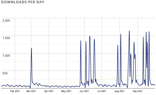
- Downloads: 123,497(+10,382)
- Active Installs: 4,721 (+108, how I calculate this exactly)
- Languages: 4 (+0)
- Five Star Reviews: 68 (+1)
- Releases: 104 (+4)
Overview of What’s New
- Pagebreak control with new CSS classes
- Include and Exclude Content from Print with new Shortcodes
- WPCampus Presentation Done!
- Keyboard accessibility improvements
The Details
Page Break Control with New CSS Classes
One challenge of printed media is page breaks: your one-giant-column-of-text-and-stuff is getting chopped into discrete pages. PMB automates a lot of that for you: eg making posts start on a new page, avoiding cutting images in half, avoiding page breaks after headers, etc. But you might want to take control of that.
To that end, PMB 3.7.0 adds some new CSS classes which control how those page breaks happen.
For example, you can specify paragraphs of text or images that should always appear on the same page. For that, add the CSS class `pmb-no-break-before` on each block (paragraph, heading, image, etc) that you want to stick together except the first.
Another example: make a particular block to always appear at the top of the page by adding `pmb-break` on it.
Last example: you set your design so most images “snap” to the top or bottom of the page, but then have one that’s an exception because your text relies on it being in a certain order. Just set your design to snap images, but then add the CSS class `pmb-dont-snap` onto images which need to be presented in a particular order relative to its surrounding text.
For info on how to achieve that perfect layout using CSS classes, read the CSS class reference section of the user guide.
Include and Exclude Content from Print with new Shortcodes
PMB does it’s best to transform your content so it looks good and is functional in the format used for reading. For example, it can change hyperlinks into footnotes or page references for print-ready PDFs, or YouTube videos into screenshots and the URL of the video. But you may have other content that needs to be presented differently in print than on the screen. What you want is to remove some content from printouts, and maybe add something different.
PMB 3.7.0 introduces new shortcodes to make that easier. Use `
` shortcode around as many blocks of text, images, or whatever, and they won’t appear on your website, but will appear in printouts.For full documentation, see user guide’s section on shortcodes.
WPCampus Presentation Done!
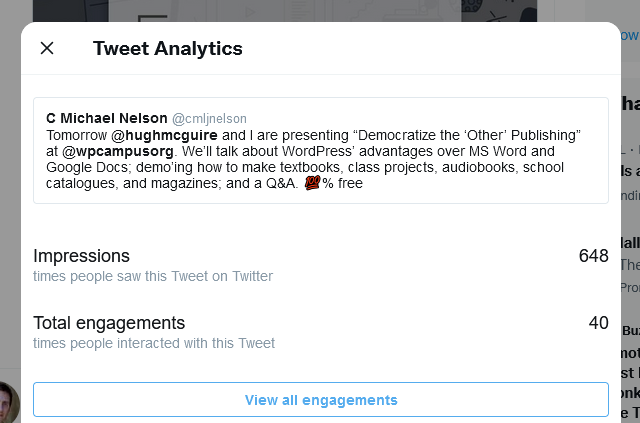
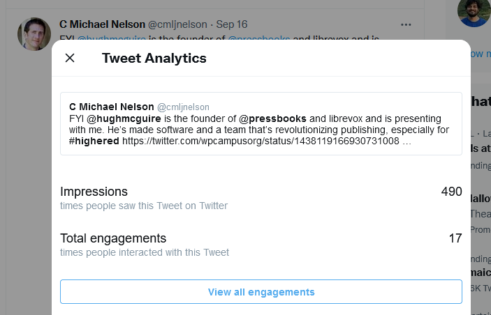
The founder of PressBooks, Hugh McGuire, and I presented at WPCampus this month. Our presentation was titled “Democratize the Other Publishing: WordPress Tools for Offline Publishing” and is already available to view on YouTube.
Our aim was to promote the use of WordPress for our shared niche: offline publishing (books, papers, e-books, etc).
We demonstrated how to use various plugins (ours, but also others like Anthologize, MPL-Publisher, and Eight Day Week) to make various documents: a book, textbook, class compilation of final projects, audiobook, school catalog, and a magazine.
It was an excellent learning opportunity for me. I saw some features in other plugins I really like (especially PressBook’s directory and designs, and MPL-Publisher’s audiobook) and some others I thought I realized weren’t that big of a deal (Eight Day Week’s integration with Adobe InDesign isn’t way better than copy-and-pasting).
I attended a bit of the other presentations too, although it was hard to be as present as I would got an in-person conference. I’m not sure I managed to make as many human connections like an in-person conference, but that might have been my fault for not being so available (eg the Zoom discussions seemed like a good way to connect).
I haven’t heard much of a reaction from it, or seen a huge influx of visitors or new installs. But it was at least a great growing experience.
Keyboard Accessibility Improvements
One benefit of participating in WPCampus this year: it made me much more aware of how accessible my plugin is to users with disabilities. And that was even before the event: I had heard WPCampus had traditionally emphasized accessibility, saw they had an entire track dedicated to it, and so expected to get at least one question about accessibility during the Q&A at the end of my presentation. So I took a few hours to see how accessible my plugin was using just a keyboard, similar to how someone using a screen-reader would.
I tried using the ChromeVox browser extension as a screen reader, but it doesn’t seem to be receiving ongoing support (they want Chrome OS users to just use their OS’s built-in screen reader, and I suppose everyone else who uses a screen reader needs a more full-featured one than what they could offer for free as a browser extension.) So I didn’t have the best experience using ChromeVox. I only got it to read the content I could tab-onto; I never got it to actually read the entire page.
But ChromeVox did show I did well to add `alt` tags to icons (eg icons to view, edit, or remove posts from projects) and using just the “tab” key and “shift+tab” I could navigate to nearly everything on the page.
But it also revealed a few things couldn’t be reached by “tabbing”. Like you couldn’t actually select content to add to projects.
So I added `tabindex=0` to all the items I needed to be “tabbable”, which helped. I later learned, however, you’re best using native form inputs, like checkboxes and buttons, instead of making `spans` and `divs` “tabbable”. One reason for that is it’s more intuitive how to use it. For example, in PMB, to actually select a post to add to a project, you have to tab over to it then press “spacebar”. I added a help tab that explains that but had I instead had a checkbox it would have been more intuitive.
So I could still improve my plugin’s keyboard accessibility, but at least it’s now entirely usable via keyboard. And of course, that’s not the only aspect of web accessibility, but it’s a big leap forward.
Thinking Out Loud
Was the Opt-In Screen Actually The Culprit for Stall in Growth?
Last month I removed Freemius’ opt-in screen from my plugin, and active installs went up significantly. But this month I left it in and the growth has slowed again. So I no longer so certain it was really Freemius’ opt-in screen’s fault. Given how removing that has reduced my email list signups to nearly nothing, leaves me thinking of re-introducing the opt-in screen.
Was WPCampus a Involvement Worth It?
Was presenting at WPCampus a good use of my time? Here’s my estimates on my inputs:
- 4 hours applying to be a presenter at WPCampus
- 8 hours making the presentation’s content
- 4 hours editing and compiling the video
- another 3 hours preparing for and attending the event.
So about 20 hours preparing it.
Here’s the benefits I got from it:
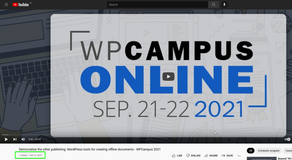
- 7 views recorded on YouTube
- at least 5 attendees to the live event (who chimed in at the beginning when there was a playback issue; I’m not sure how many were there but silent)
- 105 pageviews of the related post (the most popular post right now, the next-most popular is a transparency report from June with about 70 pageviews)
- backlink from wpcampus.org which has pretty good domain authority
- built fairly positive relationships with the founder of PressBooks, Hugh McGuire, MPL-Publisher, Ferran Figuredo, and the main organizer of WPCampus, Rachel Cherry. No big changes due to any of that, but I feel these may be helpful
- $0 cost

So it was quite a lot of work. If I were doing presentations all along a circuit (eg giving the same presentation at a ton of meetups or conferences) this wouldn’t have been so bad, but about 20 hours for a single presentation felt like quite a lot.
It didn’t directly cost me anything to make the presentation though. And though there weren’t a ton of actual viewers of the presentation, getting involved in it got me quite a bit more noticeable (especially on Twitter, on my website, and on Twitter). Lastly I didn’t do a wonderful job of networking, but it did get me a few connections I really couldn’t get any other way.
So by itself, this probably wasn’t worth it, at least in the short term. Maybe there will be some long-term benefit though. And if I’m able to reuse some of the skills and materials for similar events and the like, it could be worth it.
By itself, this presentation didn’t have the effect I had dreamt it would: cause a buzz for offline publishing with WordPress. I imagine that will require a lot more presenting, and having a tool that’s a lot more user-friendly that people want to talk about more.
What’s Next?
Still primarily wanting to get a new textbook-type design finished. Then move onto creating ePubs.
Let me know if you have any thoughts!
