Overview
This is the 19th monthly report for Print My Blog (PMB) WordPress plugin.
What Happened in This Month
Business Stats
- Hours:
- 76.75 (+2) support
- 97.75 (+3) marketing
- 256.5 (+25) development
- 41.5 (+5) management
- Expenses: $17442.12 (+1518.3)
- Donations: $503.53 USD (+0)
Plugin Stats
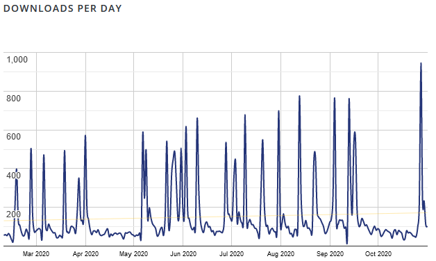
- Downloads: 62,668 (+3,618)
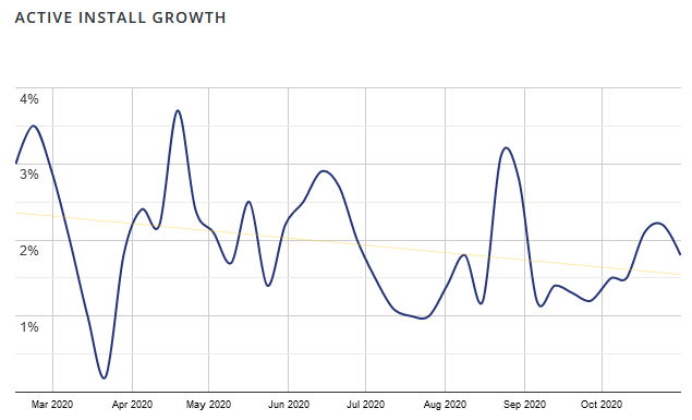
- Active Installs: 3,077 (+266, how I calculate this exactly)
- Languages: 3 (+0)
- Five Star Reviews: 50 (+5)
- Releases: 77 (+1)
Overview of What’s New
The Details
This month flew by. The free plugin reached a new milestone, while I’ve been receiving initial users’ feedback and improving the designs used by Print My Blog Pro.
🎉3,000 Active Installs!
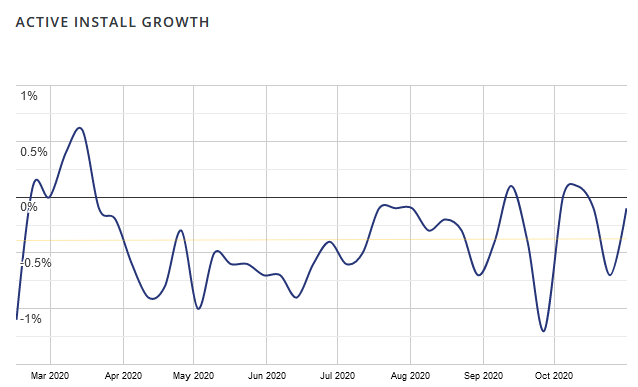
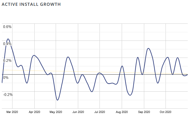
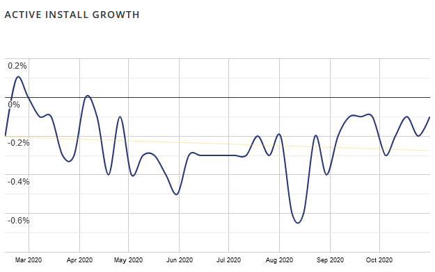
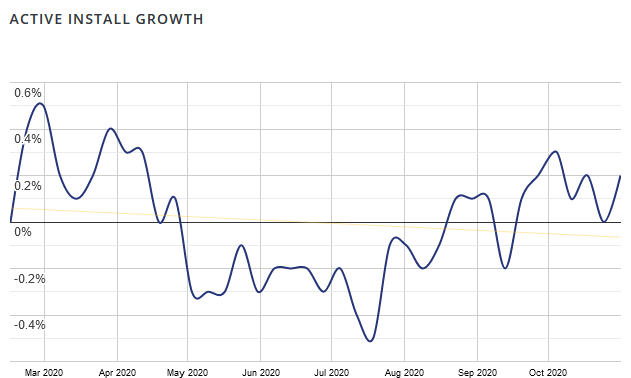
This month the free plugin reached 3,000 active installs. (It was at 2,000 in May, and 1,000 exactly a year ago). Out of curiosity, I checked how the major competitors were doing. The bigger ones seem to all be shrinking, despite generally having more users.
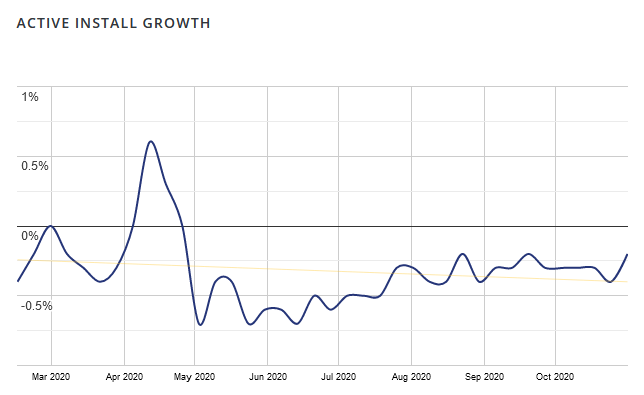
I know Print My Blog has a way to go still, though. The biggest pains seem to be:
- reliance on the WordPress REST API, which by itself is great, but very often security plugins have it disabled. There was a 1-star review of Print My Blog for this reason recently.
- reliance on browsers for printing, because they all have slightly different interfaces and options, and print the posts slightly differently too (most notable problem lately has been that some simply don’t support dividing the content into columns)
I hope the Pro version will fix those two major issues for bulk printing, and then later I’ll get open those up for working with the front-end print buttons.
Improved Galleries in Printouts
The one new feature in the free plugin this month was improved layout of WordPress Block Galleries in printouts. User tp9283 reported that after they upgraded WordPress to use the Gutenberg editor, their galleries looked worse when printed with PMB. Specifically, images in galleries can often get cut in half by a pagebreaks.
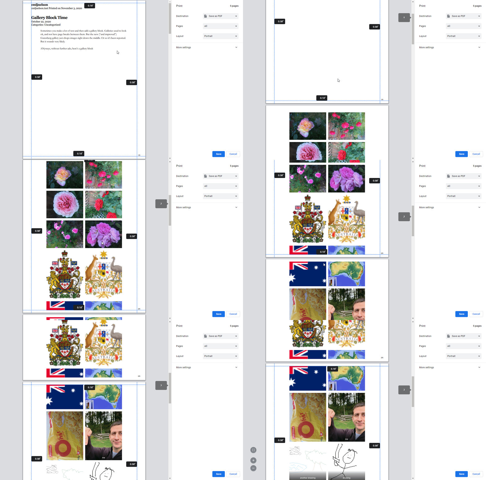
I was aware of this issue, and had previously done a band-aid fix (which just forced a page-break before a gallery, making it less likely to need to span more than one page) and was about to say “too bad” when I had the thought to investigate a bit more.
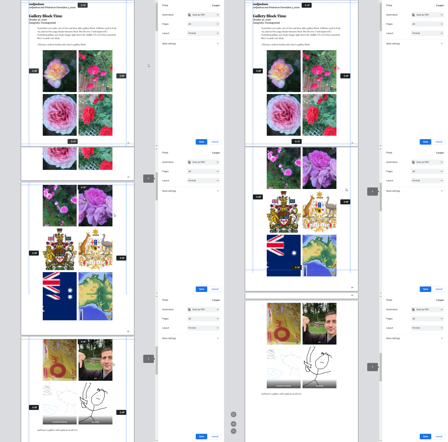
I realized the problem was a bunch of CSS that works great on screens, but not so much when printing. The culprit was every designer’s new favourite CSS feature: flexbox. It’s gaining popularity because its fully supported by all modern browsers… except when they’re printing. That’s still in-the-works.
So the fix was to turn off all the flexbox magic when printing galleries. Sorry flexbox.
Survey 2 Is Out!
I sent out the second survey this month, and have gotten a lot of very useful feedback. I’m filling up the BETA milestone on GitHub with them. I’m really glad to have so much feedback from actual users, it feels like a treasure trove of advice that’s worth a lot more than any analytics.
The first bit of feedback, while valuable, is kinda unfortunate: many of the first users didn’t realize they weren’t using the new pro features! 😫 That’s because I’m leaving the old “Print Now” tool in-place (just renaming it to “Free Quick Print”), unchanged. I added a new “projects” feature, which has all the new features I mentioned last time. I can see how users legitimately thought the pro features would be in both… but that wasn’t the case. So a lot of the feedback has actually been for the old, free tool.
So far I’ve received 10 responses from the 50 founding members I’m working with. Normally I would send out a reminder email to those who haven’t responded, but I think it would be best to instead work with the feedback I’ve already received, before sending the reminder.
The next piece of feedback was that the pro features were rather complicated to use, which I admit is probably right. There was a lot of navigating back-and-forth between the main project page and its sub-pages (like choosing the design, editing the content, editing the metadata, etc). I’m going to instead work on have a more straight-forward wizard approach: you select the project’s name and format(s), then choose the design, then customize it, then choose its contents, then metadata, and then generate the file.
So once I’ve had a week or two to work on that, I plan to send a reminder email and hopefully get a bit more feedback.
Initial Designs
Before sending out the survey, the rest of my time was mostly occupied with just making the initial set of designs look pretty good.
As a reminder, PMB Pro will have a “designs” system, inspired by WordPress’ themes system. That means the core plugin comes with a few different choices of designs for projects, but it will also be possible to add new ones in the future, and for other plugins and themes to create their own designs.
I think it’s worthwhile introducing the various designs I’ve made so far, which will hopefully give some idea at possibilities for future designs.
“Classic” Digital PDF
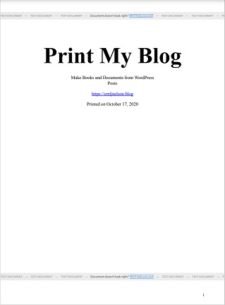
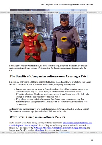
The Classic Digital PDF is meant to look a lot like the PDFs made by the old free version, just with the new Pro-only features (page numbering, table of contents, reorganizable content and custom post types, etc.)
Buurma Whitepaper
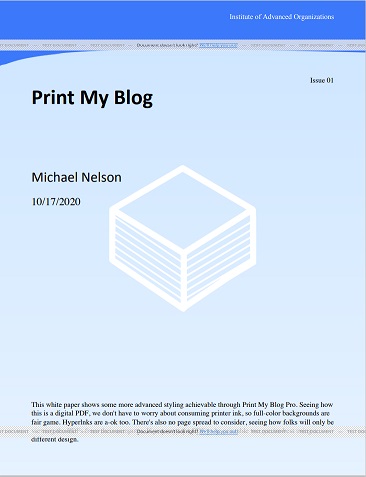
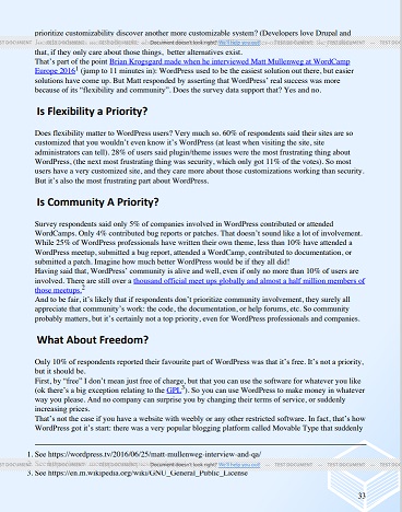
This digital design is inspired by a sample my friend Jacob Buurma provided. It’s even more geared towards reading on a screen because of its background colors, making it not so great for printing (but don’t worry, projects can have both a “Digital PDF” and a “Print-Ready PDF” configured.)
I think its a good choice for a short,online documents like whitepapers, research papers, sales materials, etc.
Mayer Magazine
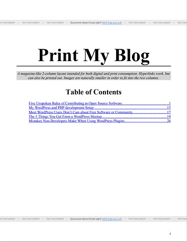
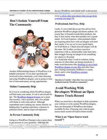
This design was inspired by a sample shared by Jean-Francois Mayer, from a printout he made a while ago using the now-defunct Zinepal.com. The main content is divided into two columns which makes it much more compact, and has a bit more of a magazine-like look.
Classic Print-Ready PDF
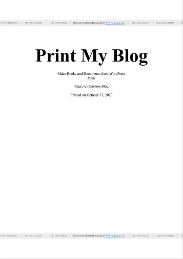
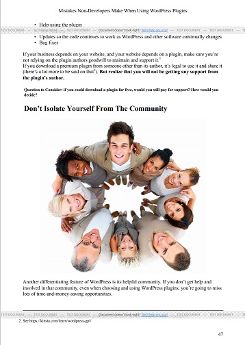
The Classic Print-Ready PDF design is intended for printing by either your home printer or a printing service. It’s intended to be read two pages at a time, like a normal book. As such, page numbering always appears on the outside corner. The title of the current part appears at the top of the left-hand page, and the current article’s title appears at the top of the right-hand page.
Economical Print-Ready Design
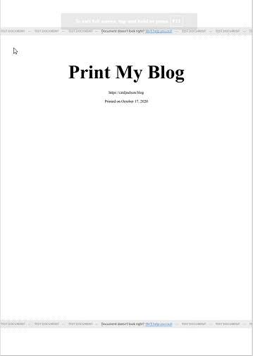
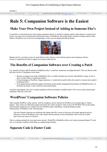
This design is very similar to the Classic Print-Ready PDF, but defaults to using smaller text and images, making it preferable if you want to save paper and ink.
Editorial Review Print-Ready PDF
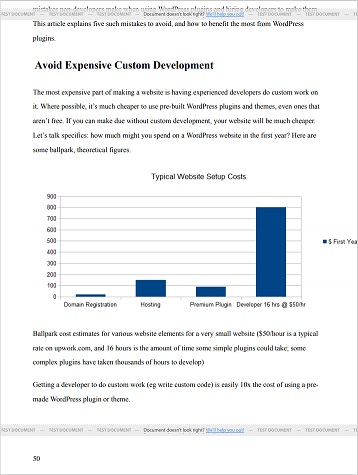
This last design is intended for handing off to someone to review and edit your work. For that reason, it has extra space between the lines of text for notes; and images are a bit smaller seeing how they aren’t the main focus.
Each design has its own set of options, like different themes. For example, a design might let you decide whether to replace external hyperlinks with footnotes or not, or let you decide how big images should be, or where to put page numbers, etc. They can also have different “templates”, so you can, example, have the title appear on one article, but have only the post’s contents appear on another.
Future designs could do other cool things, like having images that span 2 pages (so the image will spread across both the left and right pages), automatic chapter numbering (so instead of using the post titles, each article will be just appear as “Chapter 1”, where the “1” is automatically set by the post’s order), and automatically floating images to the outside of the page spread (so images will appear on the left-side of left-hand pages, and on the right-side of right-hand pages.)
Thinking Out Loud
I’m really glad I’m getting feedback from the initial founding members. A couple of them are designers or developers, but most are just regular users. And while they probably aren’t experts at plugin development or design, they kinda are experts at knowing what potential users will want, because they are potentials users. And when they make a mistake or ask a “dumb question”, I know that many other regular users, just like them, will make that same mistake or ask that same “dumb question”, and so it’s important to address their concern.
What’s Next?
I’m going to take a month to try to implement as many of the founding members’ suggestions, and then next month get started on prepping it for use by initial paying members.
Please let me know your thoughts!
