Overview
This is the 20th monthly report for Print My Blog (PMB) WordPress plugin.
What Happened This Month
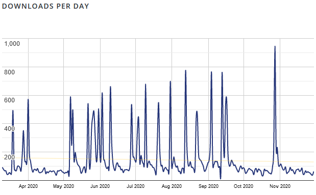
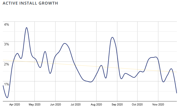
Business Stats
- Hours:
- 77.75 (+1) support
- 99.75 (+2) marketing
- 280.5 (+19) development
- 41.5 (+0) management
- Expenses: $1,8637.02 (+1,194)
- Donations: $503.53 USD (+0)
Plugin Stats
- Downloads: 64,548 (+1880)
- Active Installs: 3,221 (+144, how I calculate this exactly)
- Languages: 3 (+0)
- Five Star Reviews: 51 (+1)
- Releases: 77 (+0)
Overview of What’s New
The Details
This month I’ve mostly been in the code cave furiously coding…
Clarifying Where’s the Pro?
An overwhelming number of survey 2 respondents indicated that it wasn’t clear when you were using the free version or the pro version of Print My Blog. So this month I set about trying to clarify that.
For background: version 3.0 of Print My Blog will continue to have the same free tool (which will be called “Free Quick Print”), but it will also introduce the “pro” tool (which will be called “Pro Print”). Everyone can use the free tool to produce non-watermarked PDFs and printouts; but you’ll need to purchase a subscription to create non-watermarked PDFs with the pro tool.
Having said that, the BETA testers of 3.0 weren’t clear on when they were using the free tool and when they were using the pro tool.
Part of the problem, I think, was that I didn’t want to obnoxiously advertise to free users with pop-ups and the like. But given the confusion that created, I succumbed and put a dismissable notice at the top of the free tool, clarifying they’re using the free tool and that they might want to try the pro one.
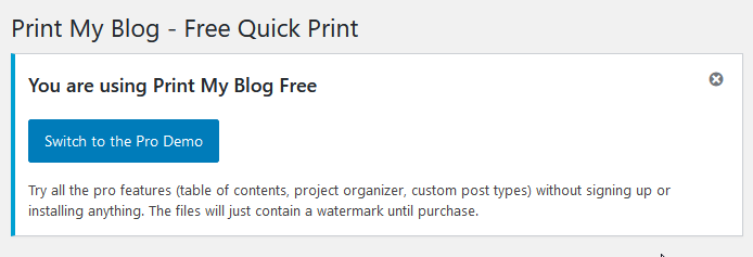
I added a similar notice at the top of the pro tool, tool. I thought it best to be up front that folks don’t have to pay if they don’t want those features… maybe that’s altruistic, but mostly I didn’t want to anger anyone unnecessarily, and making it clear there’s a well-supported free option should encourage more users to try it.
Wizards!
I wasn’t too happy with the old user interface for Print My Blog Pro. It was really easy to get lost, and overlook important options.
So I took the advise of several founding members (both Ronaldo Huerca and Michael from meyernet.de independently suggested it) and created more of a “setup wizard”. By that that I mean: when creating a project, you just do each step sequentially until you’ve done each one. And if you want to go back later and edit a step, you can.

Hopefully this will be much easier for users to understand, and help them not accidentally skip over a step like “customizing the pdf” or especially an essential one like choosing what content to put in their project.
I made another 5-minute demo video of it, which you might find helpful to watch. But I hope its at the stage where using it should be intuitive enough that you don’t need the video to understand how to use it.
(By the way, “wizards!” is what one of the characters from Lord of the Flies exclaimed to describe something really cool. I’ve remembered that useless fact for over 15 years now, I had to put it to use!)
Responding to Survey Respondents
I’ve gone through and tried to respond to all the survey respondents by email, asking follow-up questions and indicating whether I would try to implement their suggestions immediately or later. I put all the suggestions I tried to do this month into the “Pro Beta Development” milestone on GitHub and slogged through them. There were 31 issues (most of which weren’t just quick fixes!) so it kept me plenty busy this month. Here’s some example issues:
- add filter and search options to the project content page
- add a “how to” video to the project content page
- add buttons to quickly add print materials from the project content page
- add links to the projects list table
- allow changing background color in Buurma design
- show post type on project content page
- fix how PMB didn’t show content after the “more” tag
- let images float in PMB
- spiff up the loading page (which I actually did by just removing it entirely 😋)
Again see the milestone on GitHub for the full list.
Here’s a few suggestions I put off for this next month, which are in the “Pro Beta Release” milestone, or don’t yet have a milestone:
- make a table comparing free and pro
- updating the PMB logo
- set max image width instead of just height
- add a page and its children simultaneously
- bulk add contents to project (like “add all posts from February 2020”)
- ask for feedback *after* printing, not before
If you made a suggestion but it isn’t reflected in the current version of PMB Pro and you can’t find it on my GitHub issues list, then I’m sorry I may have overlooked it. Please contact me to pester me about it.
If you completed the second survey but haven’t gotten an email from me in the last month, please check your junkmail (it would be from please at printmy dot blog) and if you still don’t see it, get in touch too. Only about half of the users I emailed have responded; I think many of you are just busy with your own stuff, which is fine, but if you haven’t replied because somehow you didn’t get the email, please reach out! It’s easier to implement your suggestions earlier than later.
Thinking Out Loud
Here’s where I get to ramble on whatever’s on my mind that might be related to the plugin’s development.
Options vs Decisions
Last month I described the initial designs. Obviously each has a different look, but they can also have different options. For example, the Mayer Magazine design uses two columns, so it has options that relate to the layout within columns (eg you can choose to have images always take up the full column width, and have post titles always span both columns or fit snugly inside them). It doesn’t have some other options, though, like setting max image size because all images are going to be at most half the page width anyway. It also doesn’t have options for displaying quite so much blog metadata, like post author and categories etc. So each design can have different options from others.
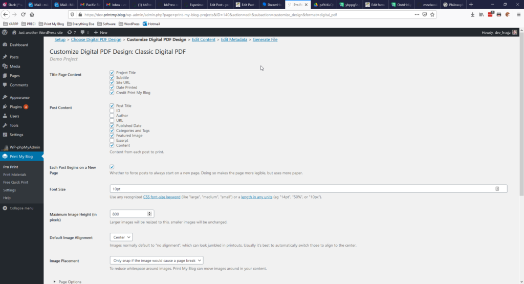
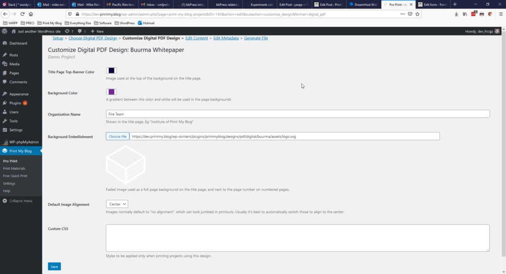
The idea is this: end-users aren’t usually designers. They don’t usually know how to lay content out very well, and so shouldn’t be burdened with too many of the design decisions. Instead, designers should create the variety of designs, and users choose the one that’s best-suited.
This can lead to a much simpler user experience: just choose a design and print. Easy peasy.
The alternative it to have a user experience akin to Adobe InDesign: a million options, and you need to read several books (one on InDesign, another on best practices for book design) to know how to use them all for your situation. Which is too difficult for most users, meaning they’d need to hire a book designer anyway.
Having said that, I have received quite a bit of feedback from people saying they want more customizing options. They want to set page sizes, image sizes, colors, etc etc.
One of WordPress’ motos is “decisions, not options“, so I’m trying to adopt that with Print My Blog Pro. But I admit it’s getting hard to draw the line…
Let’s Talk About Money
So I’ve taken a month to try to implement as much feedback as possible, but now it’s time to make the Pro version sellable. That means it needs to:
- have plans users can start paying for
- generate non-watermarked PDFs…
- but only for users with an active plan
There’s quite a bit of technical challenges there, too. But along with those, I also need to start talking with the founding members about money. How much they think the plugin is worth and what plans and tiers to make available. I love giving things away for free and feeling like the hero, but I realize I can’t always do that. I’d also like to not only make ends meet for myself, but possibly have wherewithal to hire others (I’m constantly thinking “that friend of mine would be a great WP dev!”). And that won’t happen without making ends meet. So this next month I’ll need to take off my engineering hat and put on more of my business hat. Wish me luck!
What’s Next?
I’m going to be integrating version 3.0 with Freemius, setting up this site printmy.blog to verify active subscriptions and forward PDF-creation requests to docraptor.com, and creating and sending the 3rd-and-final survey to founding members. With the holidays going on I’m not going to hold myself to a tight schedule of getting this all done by January 1st or anything. But given that I’ll actually start paying for a docraptor.com subscription, the pressure will be on a little to get it done.
Please let me know your thoughts!
2 replies on “Transparency Report of November 2020”
I think you should charge a Lifetime User fee for a set amount with a caveat that after 5 years this fee may increased or removed, but that the original lifetime users still get the lifetime deal. This would include Unlimited Websites and the offer would be limited to either a 5 year period or say the first 1,000 licenses, etc. You figure that out.
I also think you should have an Unlimited Websites Annual Fee structure that renews each year at a rate that is 0-40% off for renewals so that existing users are given an incentive to renew and get the same features but at a discounted rate so they can continue to be a subscriber.
Hi Dante, thanks for sharing your thoughts.
I want to understand your suggestion better. By “lifetime user fee”, are you suggesting a one-time payment that gives users a license to use the software forever without any further payments? Or are you suggesting that those original signups get locked in at the price they signed up for, and don’t need to worry about it increasing (they just continue repeatedly paying that same amount)?
I’ve thought quite a lot about having a lifetime license. Overall, I’d say I like it for getting started, but it doesn’t seem like a good idea long-term. Here’s my thoughts:
Pros for Users
Pros for me, the developer
Cons for me, the developer
Cons for Users
Regarding having a license that can be used on UNLIMITED sites, while users will understandably want that, I don’t think it will be realistic. That would mean I’d give UNLIMITED work and receive a FIXED amount of income. From what I’ve read that’s highly discouraged, and so it will take a lot of good rationale and data to convince me that would be a good idea.
Thoughts?