Overview
I finally created a new site dedicated to my WordPress plugin Print My Blog: printmy.blog
Important: if you’d like to continue hearing about the progress of Print My Blog, especially the pro version, sign up for the mailing list below:
All posts about Print My Blog transparency reports and tutorials will be on that site going forward; this site will still be for blogging about life, opinions, and general WordPress-related content.
I’ve copied all my old Print My Blog posts to the new site and will redirect to them from here.
Eating My Own Dog Food
My plan is to actually use the plugin on that site in order to make a book about using the plugin… that is, I will use Print My Blog on printmy.blog to print my blog into a book about Print My Blog. 🤯
Yes, I doubt many people will want to buy a book about such unknown software, so it will be primarily for my benefit: to use my own software. That will help me see more ways to improve it. In the industry I’ve heard that called “eating your own dog food.”
Site Design
If you visit the site, I think you’ll find the look of it a bit unique. Instead of using the trendy minimalist, flat design style du jour, I tried to go a bit old school…
Some inspiration:
- I recently read a blog post advocating that not every blog post needs a giant featured image. So I thought I’d try it.
- My tweep Danny Van Kooten chose to only use about 10 lines of CSS to style his homepage and it doesn’t look that bad
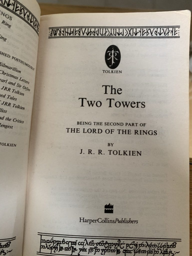
- My old Lord of the Rings novels from a couple decades ago.

Notice that there’s no giant, full-colored featured image in The Two Towers. It’s mostly just well-laid-out text, plenty of white space, and a variety of serif fonts. But something about it is not only attractive, but somehow exciting. That’s what I was wanting to my new site.

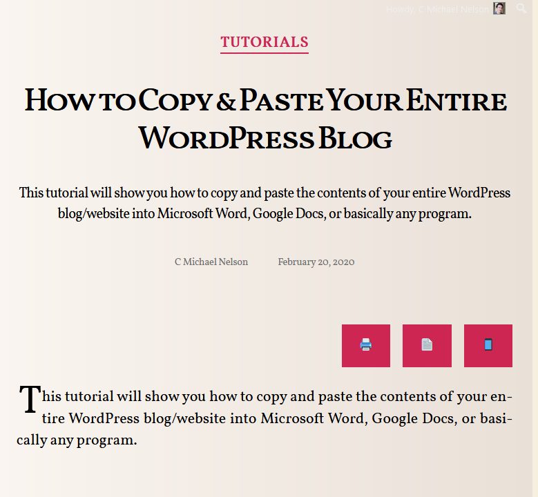
I’m still working on its design, but here’s a few things to notice:
- off-white background mimics the old book page colour
- serif font like you’d expect in a new
- no featured image, just big, small caps title
- automatic drop-cap (big first letter)
- paragraphs are left and right justified
To my surprise the thing I struggled with the most was just getting the right size font: big enough for mobile, but smaller for print. It’s admittedly my first attempt at making a theme, so I’m open to further suggestions.
Why A New Site At All?
A few reasons:
- While it was possible for someone to just subscribe to specific categories of posts on my site, it wasn’t easy or natural. So it’s nice to have a space dedicated to Print My Blog, then let my blog continue just being my blog.
- I currently have the hosted version of Print My Blog working on an old hobby site of mine, Dead Easy Family History.org. I thought putting it on a website dedicated to Print My Blog would make sense. So now the hosted version is located at printmy.blog/now
- A sales page would be more natural on a site dedicated to Print My Blog
- I’m wanting to build integration with a service called DocRaptor for creating more professional and consistent PDFs. It’s a bit technical, but I’ll basically need a server to act as a middleman between DocRaptor and WordPress sites using Print My Blog.
Redirecting Old Posts
In order to reduce confusion about which site to visit, all my old posts with the category “Print My Blog” have been imported to printmy.blog, and will automatically redirect to them. Here’s the code snippet for it, mostly copy-and-pasted from raydel.com:
add_action('template_redirect', 'mike_redirect_to_print_my_blog');
function mike_redirect_to_print_my_blog() {
    global $post;
    // this array can contain category names, slugs or even IDs.
    $catArray = ['Print My Blog', 'print my blog'];
    if (is_single($post->ID) && has_category($catArray, $post)) {
        $new_url = "http://printmy.blog/{$post->post_name}/";
        wp_redirect($new_url, 301);
        exit;
    }
}
What do you think?
Please make sure you subscribe to the mailing list (in the page footer). And let me know what you think in the comments.

1 reply on “Introducing printmy.blog”
[…] Read more about the new site in the blog post. […]